
Charts
Package: BASIC
1. General
A chart, also referred to as a diagram, is a graphical representation of data, facts or information. Depending on the purpose of the chart, highly different types are used (e.g. bar chart, pie chart or line chart).
In a list view, you can create charts which are displayed above the list view.
Charts provide the option to display data graphically. The decisive advantage of charts lies in their clarity and legibility.
Each user can create a chart in the custom list views they have created.
2. Creating a chart
A chart is always created for the view that is open when the chart is created.
To create a chart, you must first display the charts area in the list view.
To show the charts area, simply click the “Show charts” button (icon “Chart”).
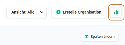 Actions icon “Create chart”
If no charts have yet been created for the relevant list view, the area appears as follows.
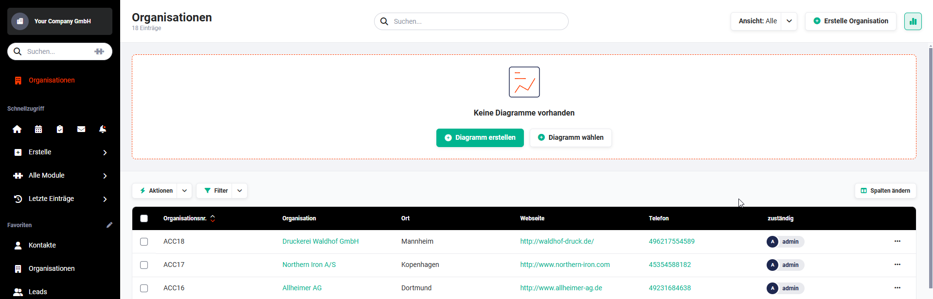 List view - Creating a chart
Two buttons are available here:
- Create chart → Creating a new chart
- Select chart → Select an existing chart
If at least one chart already exists in the view, the “Create chart” button is no longer displayed. To create another, new chart, move the mouse to the right of the chart. On mouseover, two actions icons are now displayed:
- Create chart (icon “Plus”) → opens the popup “Create new chart”, see section Creating a new chart
- Select chart (icon “List”) → opens the popup “Charts”, see section Select chart
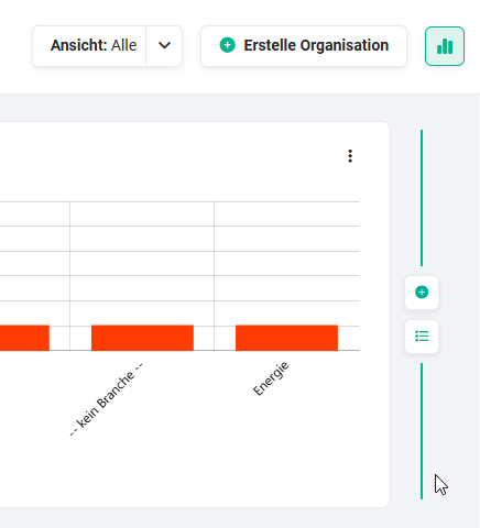 Actions icons “Create chart” and “Select chart”
2.1. Creating a new chart
After clicking the “Create chart” button, the popup “Create a new chart” opens, in which the chart is configured.
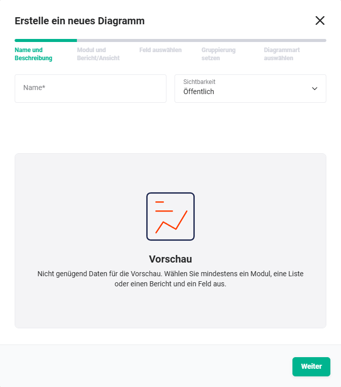 Popup “Create chart”
Creating a chart is carried out in five steps:
2.1.1. Name and description
In the first step “Name and description”, two fields are available:
- Name → Input field for the name of the chart; the name is displayed accordingly in the chart
- Visibility → picklist with the picklist values
- Public → any user can select the chart for display
- Private → only the user who creates the chart can select the chart for display
2.1.2. Module and report/view
In the second step “Module and report/view”, three fields are available:
- Select module → the module is preselected
- Chart from → the value “View” is preselected
- View → the view in which the chart is created is preselected
Since the popup “Create a new chart” is used in several places in brainX, the step “Module and report/view” is indeed included in the popup, but the fields are already prefilled and cannot be changed.
2.1.3. Select field
In the third step “Select field”, two fields are available:
- Select field → picklist with the fields of the module that serve as the basis of the chart
- Aggregation method → depending on the field type selected in “Select field”, the following values are available here:
- Count
- Sum
- Minimum
- Maximum
- Average
2.1.4. Set grouping
In the fourth step “Set grouping”, fields for the grouping can be selected. A grouping is optional and therefore does not have to be set.
After clicking the “Add” button, a picklist (including a search field) of all fields of the module is displayed.
Several fields can be selected for a grouping. To do this, simply click the “Add” button again.
2.1.5. Select chart type
In the fifth and final step “Select chart type”, the type of chart used for display is defined.
The following chart types are available:
- Horizontal bar chart
- Vertical bar chart
- Pie chart
- Funnel chart
- Line chart
- Donut
After clicking the “Save” button, the popup “Create a new chart” is hidden and the chart is displayed.
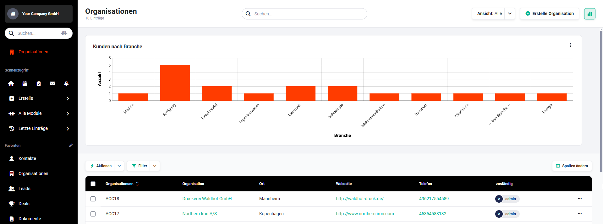 Example chart “Customers by industry” in the Organizations module, displayed as a vertical bar chart
3. Select chart
After clicking the “Select chart” button or the “Select chart” actions icon, the popup “Charts” opens.
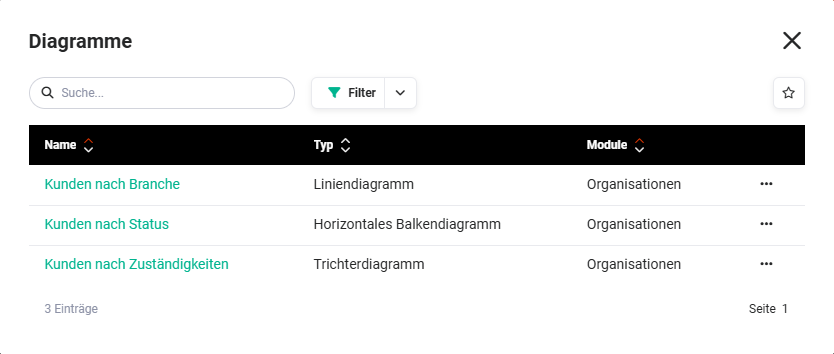 Popup “Charts”
A chart is selected by clicking the chart name.
In the right-hand column there is also an actions icon (icon “three dots”). After clicking the actions icon, a flyout menu opens with the actions “Edit” and “Delete”.
The actions are only displayed if the user has the corresponding permissions for the chart.
4. Chart actions
In each chart there is an actions icon (icon “three dots”) in the top right-hand corner. After clicking the actions icon, a flyout menu opens with the following actions:
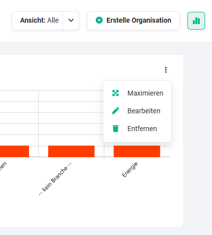 Chart actions icon
4.1. Maximise
After clicking the “Maximise” action, the chart is displayed maximised in a separate popup.
4.2. Edit
After clicking the “Edit” action, the popup “Edit the chart parameters” opens.
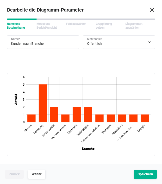 Editing a chart
The functionalities in the popup correspond to those of the popup “Create a new chart” when creating a new chart.
4.3. Remove
After clicking the “Remove” action, the chart is removed from the charts area in the list view.
The chart is not deleted! It can still be selected via the Select chart action.
5. Practical examples
1 – Leads by source as a pie chart
The marketing team wants to see at a glance which channels bring in the most leads. In the list view of the Leads module, the charts area is displayed via the Show charts button and Create chart is then clicked.
In the Name and description step, the name “Leads by source” is entered and the visibility is set to Public so that all team members can use the chart. In the Select field step, the Lead source field is chosen with the aggregation method Count. In the Set grouping step, no further grouping is added. Pie chart is chosen as the chart type. After saving, the chart appears above the list view and shows the percentage distribution of leads per source.
2 – Sales activities by employee as a bar chart
A sales manager wants to see how many tasks the individual team members have open in the Tasks module. In the list view My open tasks – or in a correspondingly filtered custom view – a new chart is created.
The field Assigned to is chosen with the aggregation method Count. No further grouping is set. Vertical bar chart is chosen as the chart type. The finished chart shows the number of open tasks per employee at a glance. The visibility is set to Public so that other managers can also display the chart.
3 – Open deals by status as a donut chart
Sales want to be able to see at any time in the list view of the Deals module how the pipeline is distributed across the various status levels. A new chart named “Pipeline by status” is created.
In the Select field step, Status is chosen with the aggregation method Count. Donut is chosen as the chart type. The chart is shared as Public and is thus available to all sales staff. Since the chart is saved independently of the active view, it can be embedded at any time via Select chart into other views of the same module.
6. Frequently asked questions
What is the difference between “Remove chart” and “Delete chart”?
Remove merely hides the chart from the current view – it remains saved and can be redisplayed at any time via Select chart. A chart is only permanently deleted when the Delete action is selected in the flyout menu in the Charts popup (accessible via Select chart).
Why can't I see a colleague's chart in the picklist?
Charts with the visibility Private are only visible to the user who created the chart. Only charts with the visibility Public are available for selection by all users.
Can I use a chart in several list views of the same module?
Yes. A saved chart can be embedded via Select chart into any view of the same module – regardless of the view in which it was originally created.
Can I use the same chart in several modules?
No. A chart is always bound to a specific module, which is defined when creating it in the Module and report/view step. A separate chart must be created for a different module.
How many charts can I display simultaneously in a view?
There is no fixed upper limit. Several charts can be displayed side by side in a list view. New charts are added via the plus icon to the right of an existing chart.
Does a chart respond to filters set in the list view?
Charts in the list view are based on the selected view and its filter configuration. If additional filters are set in the list view, these directly affect the data displayed in the chart.