
View (List View)
Package: BASIC
1. General
Using the “View” functionality, existing list views can be selected, existing views edited, or new views created.
In views, the displayed columns, filters, sortings, Kanban boards, and geo-filters can be defined.
2. Actions in the view's flyout menu
After clicking “View”, a pop-up window opens in which the following functionalities are available for selection:
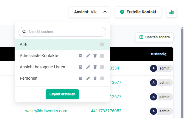
2.1. Search view
The search consists of an input field in which the search term can be entered.
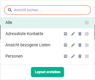
Searching for a view has the following characteristics:
- Uppercase/lowercase is ignored
- a search is possible from a character count of one
- from the entry of the first character, matching entries are automatically suggested
- it is not relevant whether the typed search text is located at the beginning of a word or at another position within the matching text
2.2. Kanban Board
Kanban is essentially a method for defining, controlling, and improving processes. The Kanban view is a visual aid that provides an overview of the current work status and simplifies communication within the team.
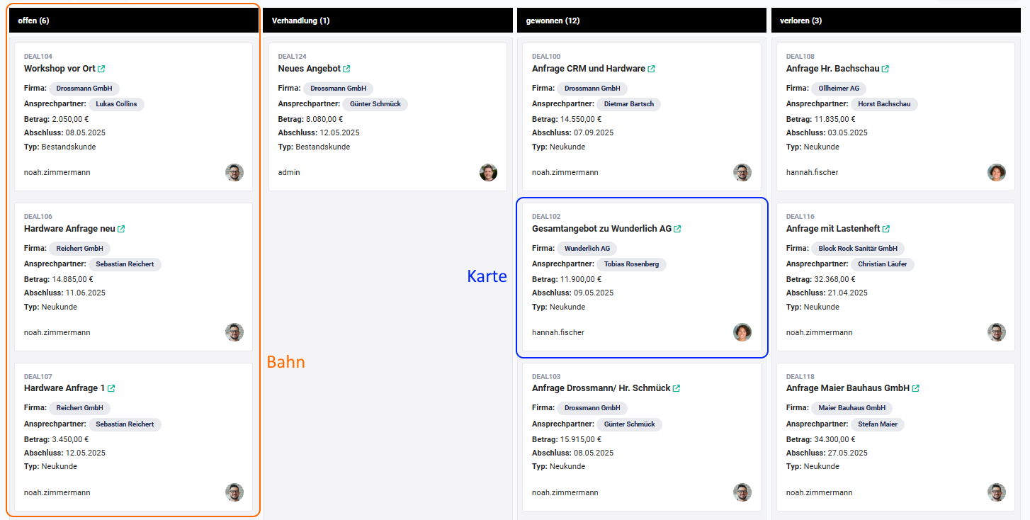
In the Kanban view, “lanes” are displayed which contain so-called “cards”. A picklist is chosen as the basis for the lanes. The selected value of the picklist is then displayed as a lane. Selected information from records is displayed in a card. Which fields are displayed on the individual cards is freely configurable.
By moving the cards via Drag & Drop into other lanes, field values (picklist values) are changed in the respective records (e.g. status “open” to “in progress”).
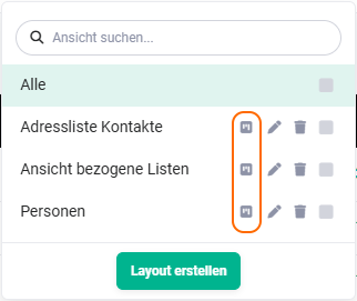
Using the action icon “Kanban Board”, Kanban boards can be created or edited.
 Views - Kanban Board
After clicking the action icon “Kanban Board”, the “Custom Filters” pop-up opens on the “Kanban Board” tab.
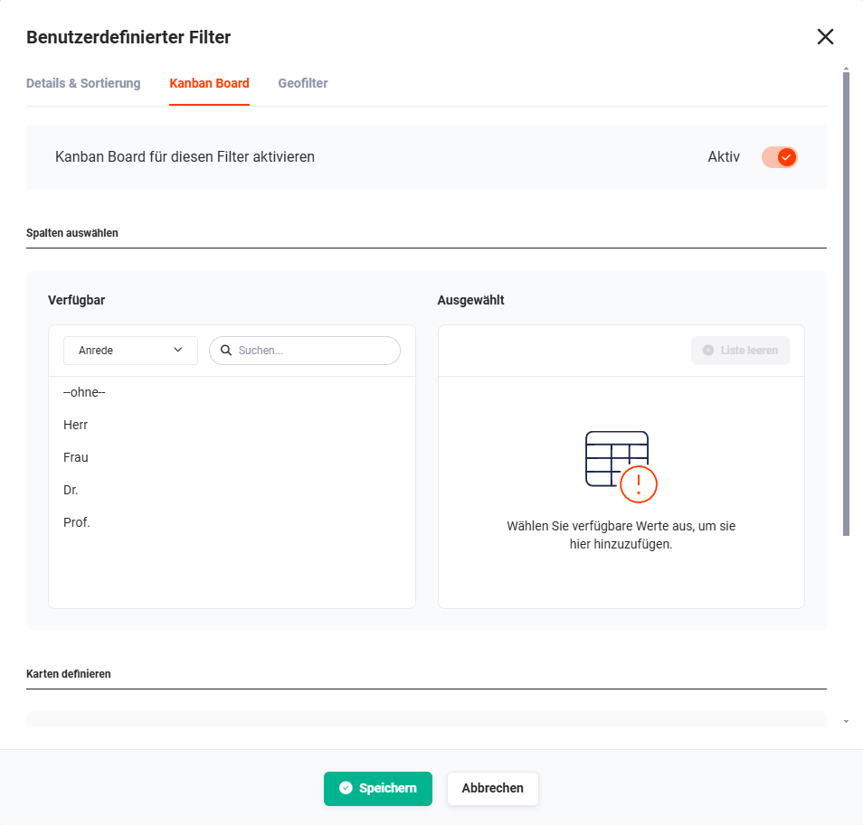 Custom Filters pop-up - Kanban Board - Select columns
The configuration of the Kanban board is described in detail in the section Kanban Board.
2.3. Edit
Using the action icon “Edit” (“pencil” icon), existing views can be edited.
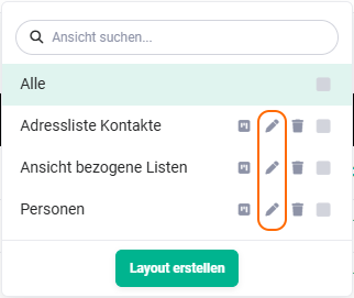 Edit views
The “All” view is a system-owned view and cannot be edited!
After clicking the action icon “Edit” (“pencil” icon), the “Custom Filters” pop-up opens on the “Details & Sorting” tab.
Custom Filters pop-up - Kanban Board - Select columns
In the “Custom Filters” pop-up, the desired changes can now be made. The functionalities correspond to those described in the section Creating a new view.
To apply the changes, the “Save” button must be clicked at the end.
2.4. Delete
Using the action icon “Delete” (“Recycle Bin” icon), existing views can be deleted.
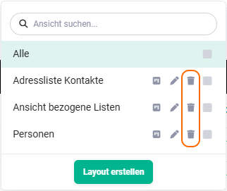 Delete views
The “All” view is a system-owned view and cannot be deleted!
After clicking the action icon “Delete” (“Recycle Bin” icon), a pop-up for confirmation is displayed.
After clicking the “Confirm” button, the view is irrevocably deleted. Using the “Cancel” button, the deletion process can be cancelled.
2.5. Set as default
A view can be defined as “default” using the checkbox. A list view can be set as the default for the user using the checkbox. When the module is opened, this list view is loaded by default.
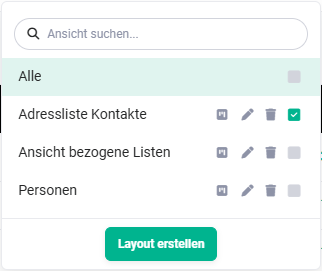 Views as default
3. Creating a new view
A custom list view is a list view in a module in which it can be individually defined which fields from the detail view of a record are displayed in the list view.
Additionally, filters and sortings can be configured.
To create a new list view, the “Create layout” button must be clicked. The “Custom Filters” pop-up opens, which is divided into the following tabs:
- Details & Sorting → Configuration of the list view and definition of filters
- Kanban Board → Activate and configure Kanban board
- Geo-filter → Activate and configure geo-filter
3.1. Details & Sorting
On the “Details & Sorting” tab, both the details of the view, the filters, and the default sorting are defined.
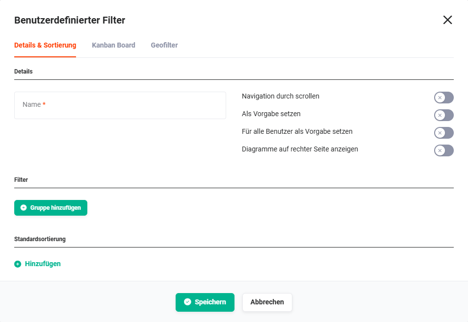 Custom Filters pop-up - Details & Sorting
The sorting of a list view also affects the cards within the Kanban view.
3.1.1. Details
The following configuration points are available in the Details area:
- Name → Name of the view
- Navigation by scrolling → The records are not displayed page by page; instead, all records are displayed “on one page” and navigation takes place by scrolling.
See also the point “Number of entries in the list view” in the section Module management - Standard settings. - Set as default → The view is set as the default (standard view) for the user.
- Set as default for everyone → The view is set as the default (standard view) for all users.
- Show charts on the right side → Charts are displayed above the list view by default. If this setting is activated, charts are displayed to the right of the list view.
See also the point Charts in the section Structure/Layout list view - Charts.
3.1.2. Filter
Filters can be used to display only certain records in a list view.
To configure filters for a view, in the first step the “Add group” button must be clicked in the “Custom Filters” pop-up on the “Details & Sorting” tab.
An additional row with the “Add filter” button is now displayed.
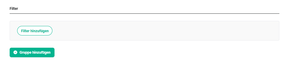 Custom Filters pop-up - Add filter
After clicking the “Add filter” button, a flyout menu with all fields is displayed.
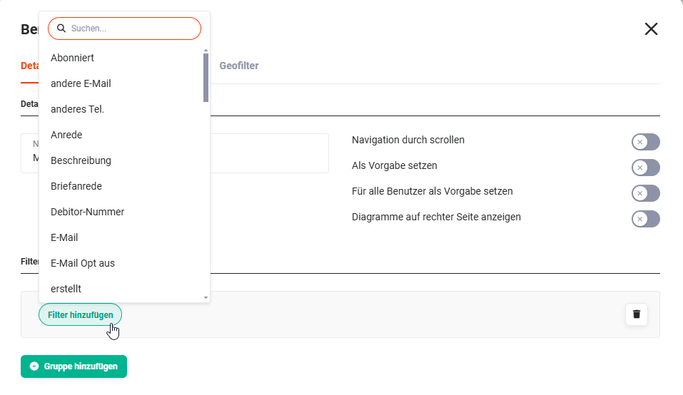 Custom Filters pop-up - Add filter - Field selection
A search field is integrated in the flyout menu of the field selection, in order to find the desired fields more quickly.
Depending on the field type, the possible filter values are displayed in a further flyout menu.
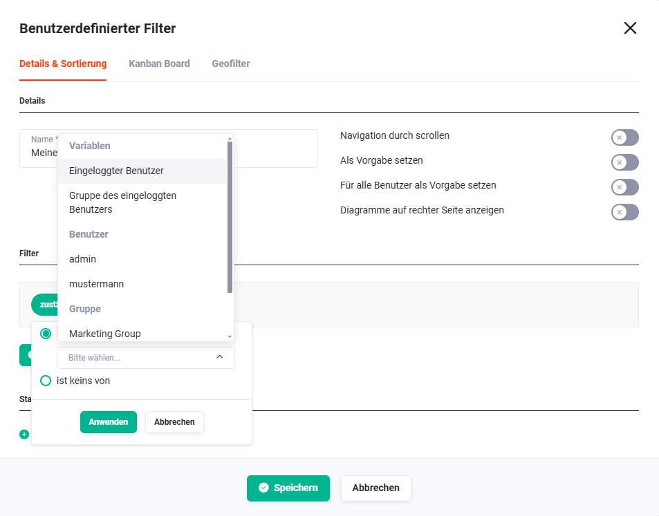 Example: Filter on the field “responsible”
After the selection, the filter is displayed as follows:
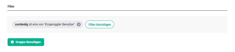 Example: Filter on the field “responsible” with the filter criterion “is one of Logged-in user”.
Using the “Add filter” button, further filter criteria for the selected field can now be defined.
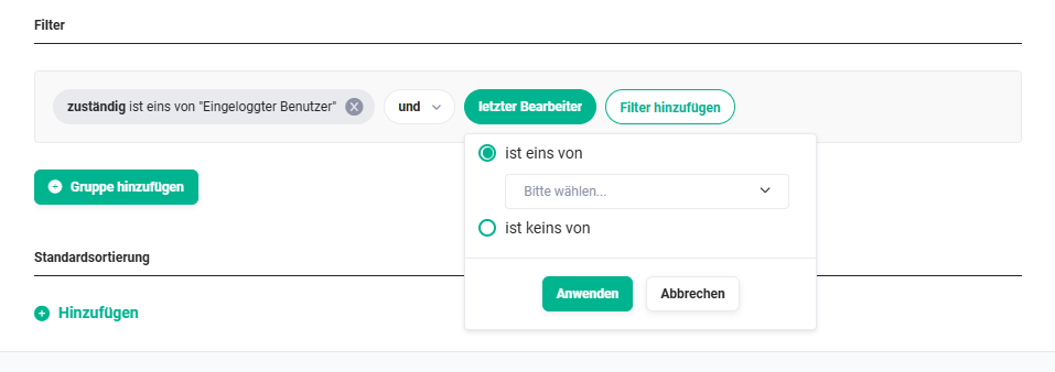 Example: second filter criterion on the field “last editor”
Multiple filter criteria within a group are linked using “and” or “or”.
AND links are always evaluated as true or false before an OR link.
If two conditions are linked with AND, both conditions must be met for the filter to apply. If, on the other hand, two conditions are linked with OR, only one condition needs to be met for the filter to apply.
By linking conditions using AND/OR and using further groups, complex filter conditions can thus be configured.
The view can now either be saved, or further groups with filter criteria can be added.
Using the “Add group” button, a further group area can be added.
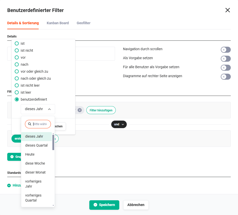 Example: second group with a filter on the field “created”
After configuring the second group, the Filter area is displayed as follows.
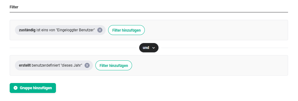
Multiple groups are linked using “and” or “or”.
AND links are always evaluated as true or false before an OR link.
If two conditions are linked with AND, both conditions must be met for the filter to apply. If, on the other hand, two conditions are linked with OR, only one condition needs to be met for the filter to apply.
By linking conditions using AND/OR and using further groups, complex filter conditions can thus be configured.
Finally, the “Save” button in the “Custom Filters” pop-up must now be clicked in order to save the view.
3.1.3. Default sorting
In the Default sorting area, one or more rules for the sorting of the columns in the list view can be defined.
To configure a default sorting for a view, in the first step the “Add” action link must be clicked in the “Custom Filters” pop-up on the “Details & Sorting” tab.
 Custom Filters pop-up - Default sorting
After clicking the “Add” action link, an additional row with the field selection is now displayed.
 Custom Filters pop-up - Default sorting - Field selection
In the “Field” picklist, the desired field for the sorting can now be selected.
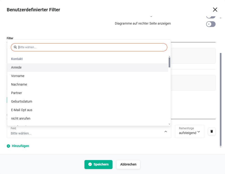 Custom Filters pop-up - Default sorting - Field selection
In the “Order” picklist, it is defined whether the sorting is in ascending or descending order.
Further fields (columns in the list view) can also be chosen for further sortings. To do this, click the “Add” action link again.
After the selection of a second field for sorting, the Default sorting area is displayed as follows.
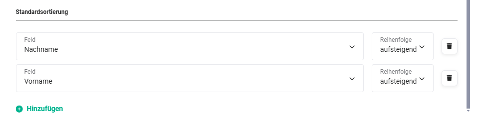 Example: Sorting is first done in ascending order by last name and then in ascending order by first name.
3.2. Kanban Board
Kanban is essentially a method for defining, controlling, and improving processes. The Kanban view is a visual aid that provides an overview of the current work status and simplifies communication within the team.
In the Kanban view, “lanes” are displayed which contain so-called “cards”. A picklist is chosen as the basis for the lanes. The selected value of the picklist is then displayed as a lane. Selected information from records is displayed in a card. Which fields are displayed on the individual cards is freely configurable.
By moving the cards via Drag & Drop into other lanes, field values (picklist values) are changed in the respective records (e.g. status “open” to “in progress”).
A Kanban board can only be created in a custom list view.
A new Kanban board can be created either in an already existing custom list view (see section Editing a view) or in a new custom list view (see section Creating a new view).
In almost all modules, there is the option to create a Kanban board.
In the following modules, no Kanban board is available:
- Reports
- Email Marketing
- Email accounts
- Emails
- Recycle Bin
- PBX Manager
- Sync Conflicts
- Appointments
- Templates
3.2.1. Activate Kanban board
To create a Kanban board, or to activate a Kanban board in a custom list view, the toggle at “Activate Kanban board for this filter” must be set to “Active”.
Custom Filters pop-up - Kanban Board - Select columns
3.2.2. Select columns
In the “Select columns” area, the “Available” section is located on the left side.
Custom Filters pop-up - Kanban Board - Select columns
Using a picklist, the fields to be used as columns (“lanes”) in the Kanban board can be selected here.
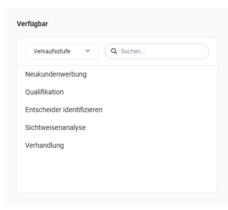 Example: Picklist “Sales stage” selected
In principle, all fields of the type picklist of the respective module are available here. Next to the picklist of fields, there is also an input field in which fields can be searched for.
By clicking the picklist values in the “Available” area, the values are moved to the right into the “Selected” area.
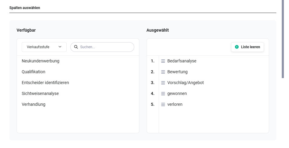 Example: five picklist values of the field “Sales stage” were selected
In the “Selected” area, the picklist values can now be sorted using Drag & Drop. On mouseover of a value, the “x” icon is displayed to remove values again. Using the “Empty list” button, the entire list can be emptied.
In the next step, the so-called “cards” must now be defined.
3.2.3. Define cards
The “Define cards” area is divided into the “Preview” and “Edit field” sections.
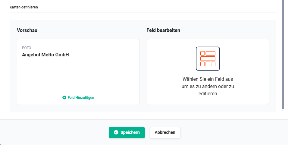
In the “Preview” area, a field for display in the card can now be defined using the “Add field” action link.
The record number and the title of the record are always displayed by default.
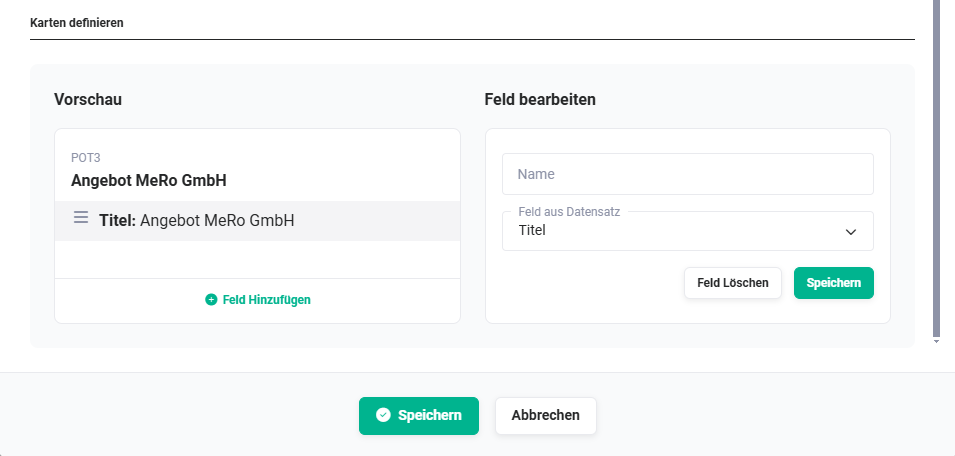 Kanban Board - Define cards
In the “Field from record” field, the name of the field is displayed. If a different name is desired for display in a card, this name can be entered in the “Name” field.
Using the “Save” button in the “Edit field” area, the field is added to the card. Using the “Delete field” button, a selected field can be deleted from the card again.
After the selection of a field, further fields can now be selected by clicking the “Add field” action link again.
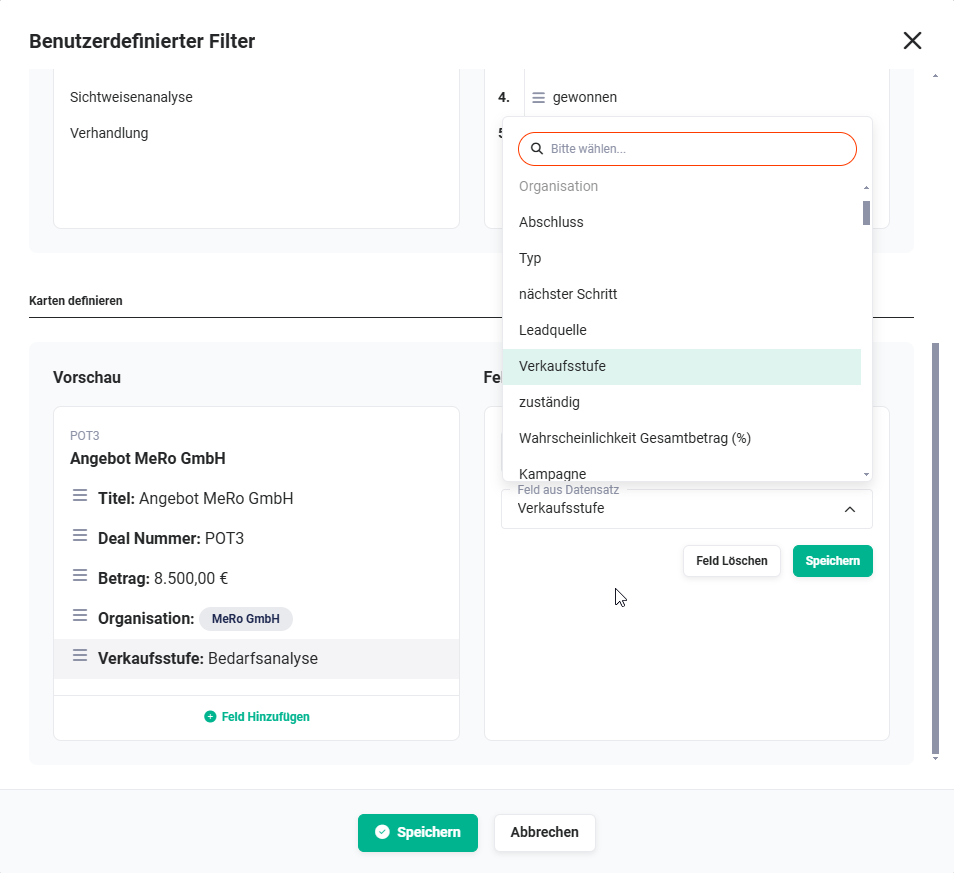 Kanban Board - Define cards - Field selection
After completing the selection, the “Save” button must now be clicked in order to save the configuration of the Kanban board.
3.2.4. Display Kanban board
If a Kanban board has been configured for a custom view, then the “Table” and “Board” buttons are displayed at the top right above the list view, by means of which it is possible to switch between the list view (“Table” button) and the Kanban view (“Board” button).
The button of the active view is not active and greyed out accordingly.
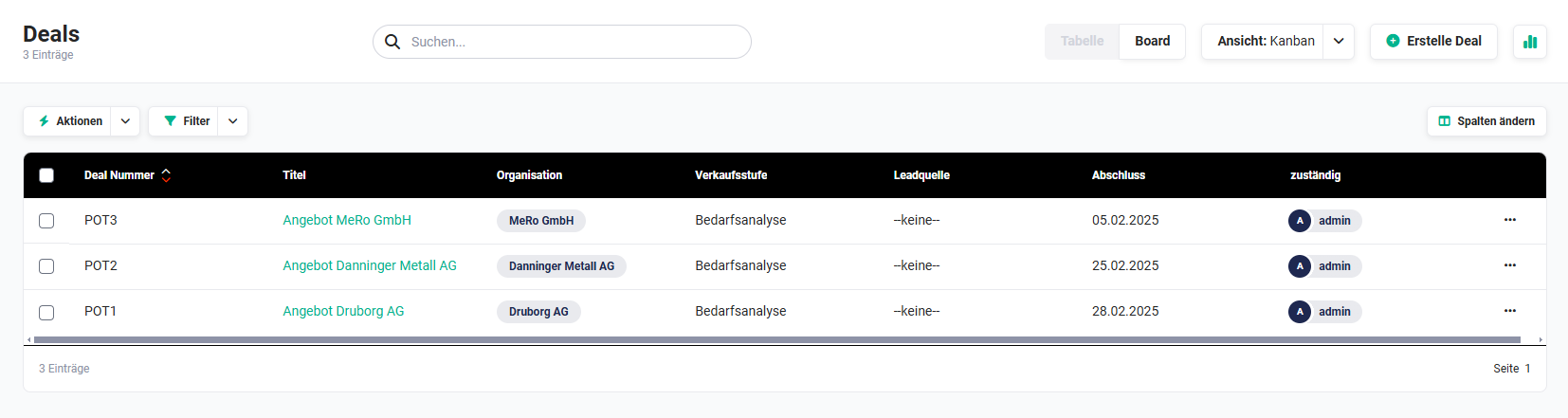 List view - Kanban Board button
3.2.5. Using the Kanban board
The use of the Kanban board is explained below using the example of the Deals module. The picklist “Sales stage” was chosen here as the basis for the lanes.
In the following screenshot, a total of three deals exist. Two deals have the sales stage “Needs analysis”, one deal has the sales stage “Proposal/Quote”.
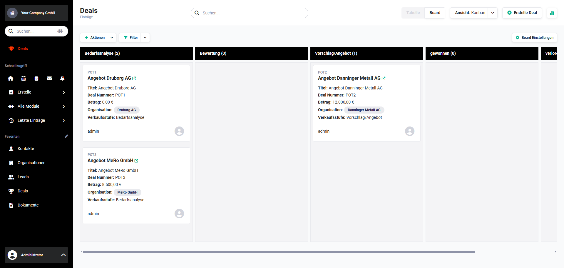 Example view Kanban Board
A deal can now be moved into another lane using Drag & Drop.
In the following screenshot, a deal is moved from the lane “Needs analysis” into the lane “Evaluation”.
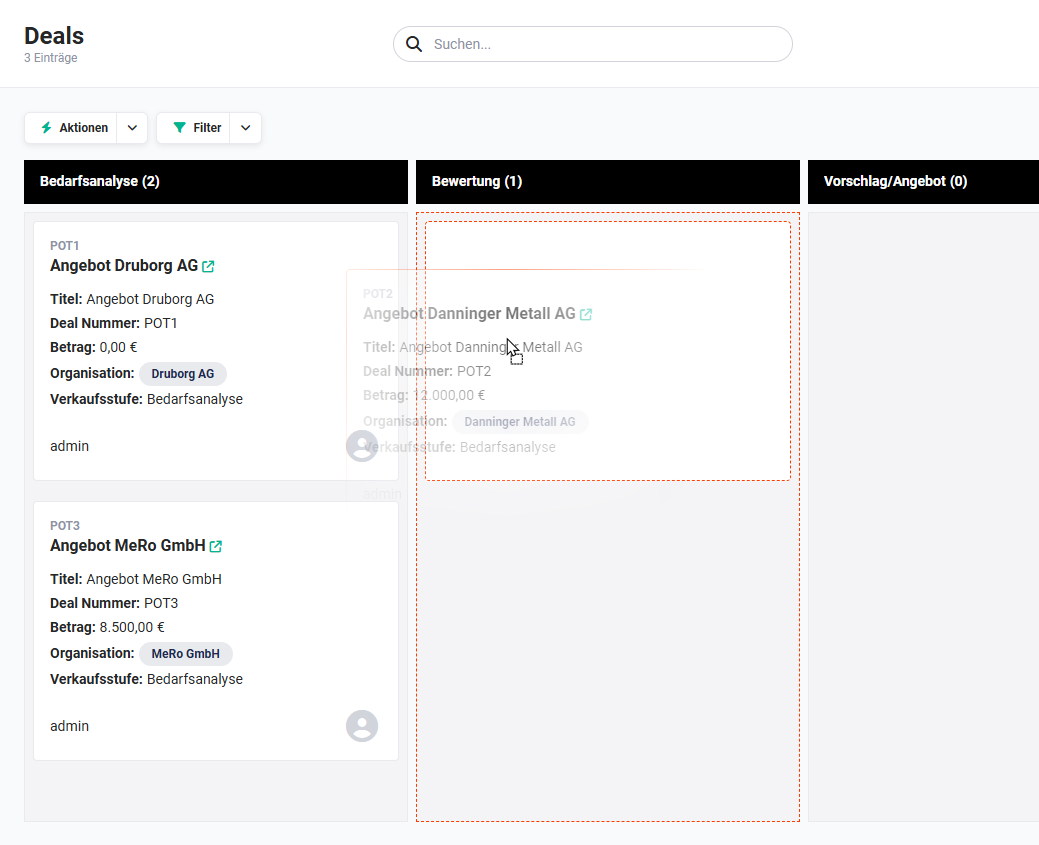 Kanban Board - Move cards
By moving it, the picklist value of the picklist “Sales stage” is now changed from “Needs analysis” to “Evaluation” in the record.
Cards can be moved into any lane as often as desired, whereupon the picklist value of the picklist - in the example “Sales stage” - changes accordingly each time.
For performance reasons, a maximum of 200 records/cards in total (combined for all lanes) are displayed in the Kanban board.
A Kanban board can be created by any brainX user. However, in order to also be able to move cards between the lanes, the “Edit” permission for the records is required (see section Profiles).
If this permission is not available, the user is shown the note “You are not authorised to edit the field of the Kanban view!” in the Kanban view.
3.3. Geo-filter
In order to be able to use the geo-filter, the integration Geodata determination must be configured.
3.3.1. Availability of the geo-filter in modules
The geo-filter is divided into two categories, on the one hand with direct data reference and on the other hand with indirect data reference.
Direct reference data are considered to be modules that contain address data themselves and for which coordinates have also been determined.
Records with an indirect reference are found in modules that have a reference (link) to at least one module with direct localisation data (a so-called “1:n” reference must be present).
This means that the relation to a record with longitude and latitude must be available for selection in the detail view. Only in this case can a unique assignment be entered.
- Modules with direct coordinates:
- Leads
- Contacts
- Organizations
- Partner
- Modules with indirect coordinates:
- Modules with valid references to Leads:
- Timesheets (related to)
- Tasks (More information)
- Appointments (More information)
- Modules with valid references to Contacts:
- Deals (related to)
- Invoice (Contact name)
- Credits (Contact name)
- Tickets (related to)
- Purchase Order (Contact person)
- Projects (related to)
- Timesheet (related to)
- Tasks (More information)
- Appointments (More information)
- Modules with valid references to Organizations:
- Timesheets (related to)
- Contacts (Organization)
- Deals (related to)
- Quotes (Organization)
- Sales Orders (Organization)
- Invoice (Organization)
- Licenses (Organization)
- Credits (Organization)
- Tickets (related to)
- Projects (related to)
- Tasks (More information)
- Appointments (More information)
- Modules with valid references to Partner:
- Timesheets (related to)
- Leads (Partner)
- Contacts (Partner)
- Organizations (Partner)
- Deals (Partner)
- Quotes (Partner)
- Sales Orders (Partner)
- Invoice (Partner)
- Credits (Partner)
- Tickets (Partner)
- Projects (Partner)
- Licenses (Partner)
- Tasks (More information)
- Appointments (More information)
- Modules with valid references to Leads:
3.3.2. Configure geo-filter
To activate a geo-filter in a custom list view, the “Active” toggle must be set to “on”.
Only after the activation of the geo-filter are the fields for configuration displayed.
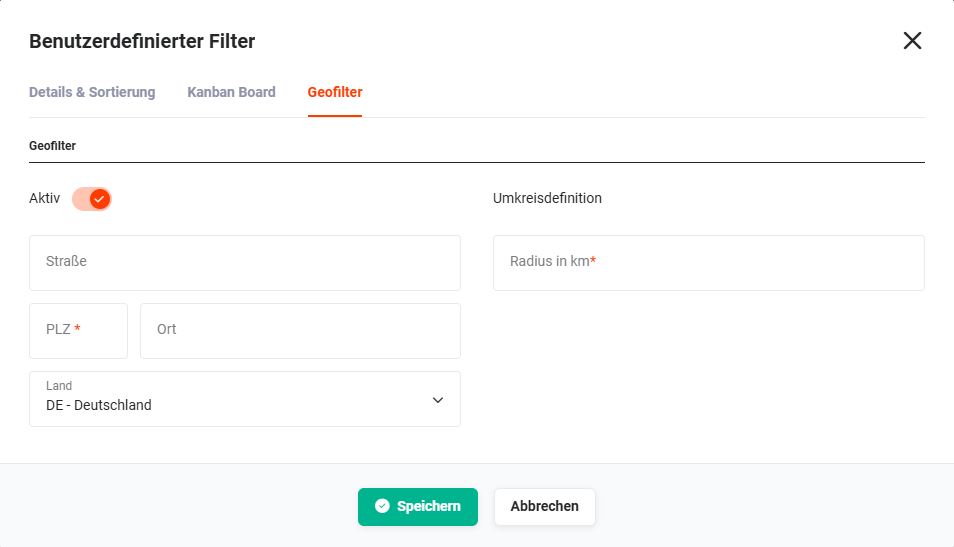 Custom Filter pop-up - Geo-filter
On the left side are the fields
- Street
- Postcode
- City
- Country
which are required to define the starting point.
On the right side, in the “Radius definition” area, is the “Radius in km” field. In the “Radius in km” field, the maximum distance (as the crow flies) to the relevant addresses is entered.
If a geo-filter is configured in a module with indirect coordinates, the “Module” field is additionally available on the right side in the “Linked addresses” area.
Using the “Module” picklist, it must be defined from which module the address is to be taken.
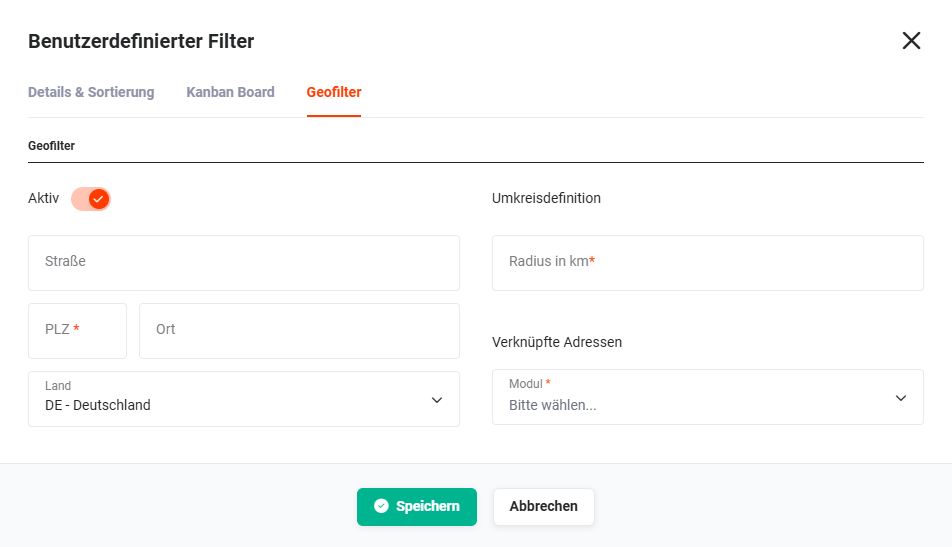 Custom Filter pop-up - Geo-filter - linked addresses
3.3.3. Using the geo-filter
When the geo-filter is active, only records that correspond to the radius definition are now displayed in the list view.
In the list view, a new “Globe” icon is displayed in the “Actions” column. On mouseover, both the address used and the module (by means of an icon) from which the address originates are displayed.